Not lying exactly. It’s telling you the truth about one moment. The problem is that the moment you test is almost never the moment your internet is worst.
Think about when you actually run a speed test. Something annoyed you, you got around to checking, and by then it’s usually a Tuesday afternoon and everything reads fine. The thing that actually bothered you happened at half past eight on Saturday night, and by the time you thought to measure it, it had fixed itself.
So you get 94 Mbps, shrug, and conclude the problem is in your head.
This is the gap OBBR Pulse fills. It re-tests your connection every 30 minutes and charts the whole day, so instead of one number you get a pattern. And a pattern is the thing you can actually do something with.
What a real two day run looks like
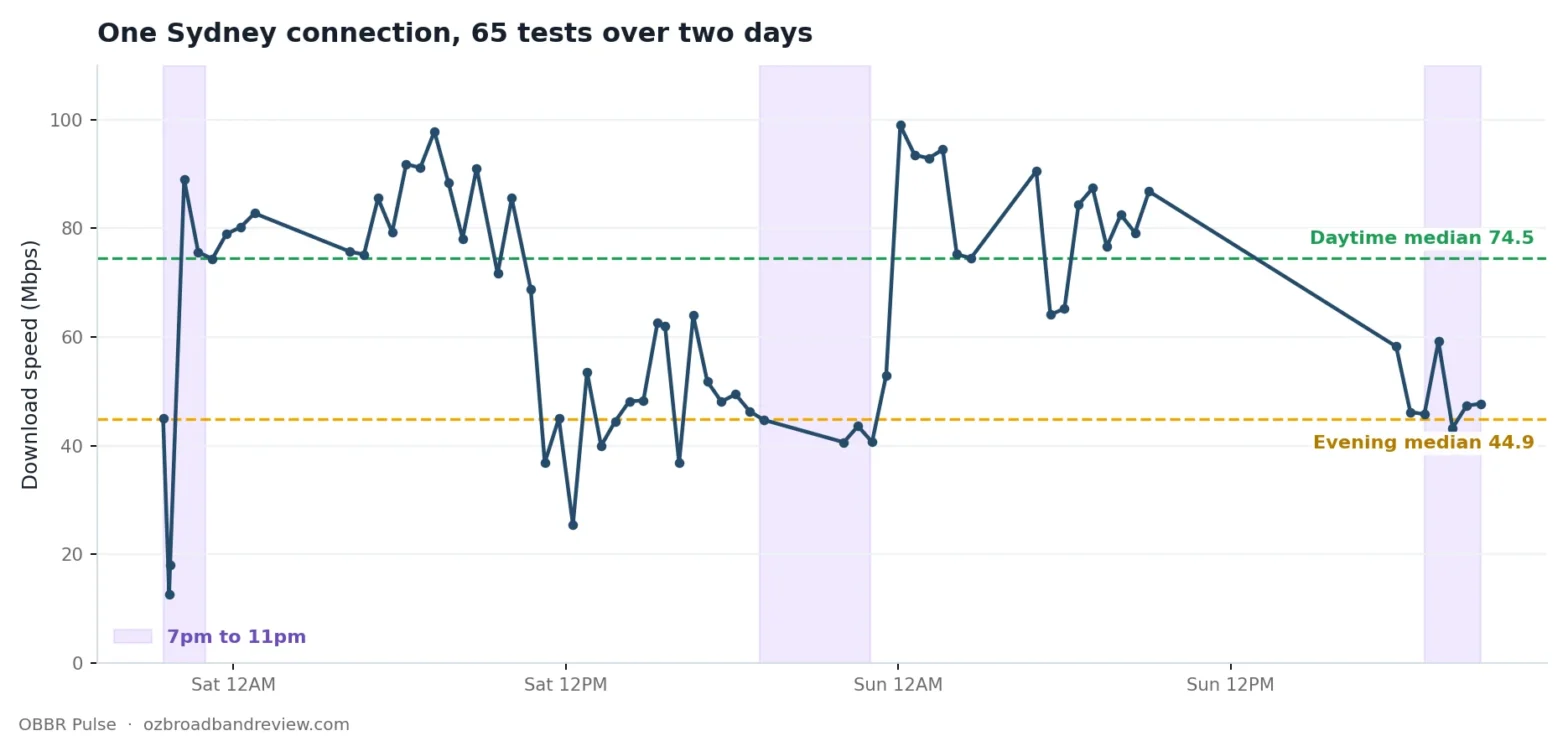
Here’s an actual Pulse run from a Sydney household. 65 tests across two days in August. I haven’t smoothed it or picked a flattering window, this is the raw run.
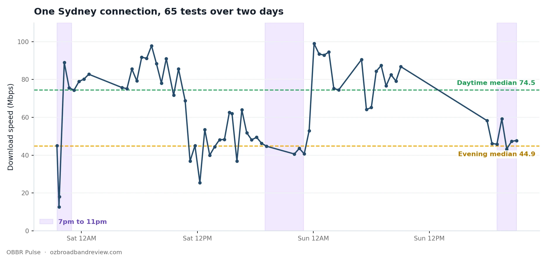
Look at what a single test would have told this person, depending on when they happened to run it.
At 10pm on Saturday: 41 Mbps. Terrible, ring the provider.
At 1am on Sunday: 99 Mbps. Brilliant, nothing wrong here.
Same connection, same week, same plan. A 58 Mbps difference decided entirely by what time somebody clicked a button.
The median across the whole run is 65.2 Mbps. But split it by time of day and the real story appears: 74.5 Mbps median through the day, 44.9 Mbps median between 7pm and 11pm. That’s a 40% drop in the exact four hours when a household actually wants its internet.
You cannot see that with one test. You can’t see it with five tests either, if you run them all on a weekday afternoon.
OBBR Pulse
See what your connection does all day
Run the speed test first, it takes 25 seconds, then Pulse is one tap on the results page. Free, no signup, nothing to install.
Try Pulse on my connectionLeave it running through an evening and you will have a chart worth sending to your provider.
The other thing this run shows
There’s a second problem in that data that no normal speed test would have caught at all.
Bufferbloat was graded F on 63 of the 65 tests.
Bufferbloat is the delay your connection adds when it’s already busy. Your speedometer can read 90 Mbps while a video call falls apart, because the moment something else starts using the line, ping balloons. In this run the median ping was 51 ms, but the worst reading was 1,197 ms. That’s over a second of delay on a connection that, on paper, looks fine.
That’s the difference between “my internet is slow” and “my internet is fast but everything feels laggy”, and it’s why we grade bufferbloat A to F on every test. Most Australian speed tests skip it entirely.
Why the evening is different
If your speed drops between 7pm and 11pm, that’s usually not your provider being dishonest. It’s how a shared network behaves.
The NBN sells providers capacity in bulk, and providers buy enough to serve their customers based on expected demand. In the evening, everyone in your area is streaming at once and that shared capacity gets stretched. Some providers buy more headroom than others, which is the real difference between them and exactly what the delivery rankings are built to show.
It also means the fix isn’t always a faster plan. If you’re on NBN 100 and getting 44 in the evening, moving to NBN 250 may just get you a bigger number that also drops at 8pm. The useful question is whether other people on your setup, with your provider, see the same dip. That’s what the rankings are for.
The bit that actually helps: talking to your provider
This is the real reason to run Pulse.
Support teams get “my internet feels slow” a hundred times a day. There’s nothing they can do with it. It isn’t a fault report, it’s a mood.
A Pulse chart is a fault report. “It drops to 44 Mbps every night between 7 and 11, here are twelve tests over two days showing the same pattern, and bufferbloat graded F on nearly every one of them” is a completely different conversation. It’s specific, it’s timestamped, it’s repeatable, and it points at congestion rather than at your wifi.
Every Pulse run now gets its own link you can send to anyone. No login on their end, no account, they just see the chart. Send it with your ticket.
How to run it properly
Pulse opens in a popout window and tests every 30 minutes. Leave it running while you get on with something else. A few things worth doing:
- Turn off any VPN. You’ll measure the VPN, not your connection.
- Leave the window open. If you close it, it stops.
- Don’t schedule a huge download during the run, unless you’re specifically trying to see what heavy use does to your line.
- Run it across an evening. A run that stops at 6pm misses the entire point.
The honest limitation: Pulse measures from one device on one connection. If someone in the house starts a 4K stream mid run, that shows up in the results. When you’re diagnosing a problem that’s a feature, because it’s real life. When you’re comparing yourself to other people it’s a caveat, which is why Pulse results are deliberately excluded from the public rankings. One household running all day would swamp them.
Is there anything else like this?
Continuous speed monitoring itself is not new, and I want to be straight about that. There are a handful of free browser based tools overseas that will sit there and re-test your line on a loop, and if all you want is a graph of your speed over time, one of those will do the job.
What none of them do is the part that actually matters for an Australian connection.
They test against whichever server is nearest or fastest, which for a lot of them is not in Australia, so you end up measuring the route rather than your line. They do not measure bufferbloat, which in the run above was graded F on 63 of 65 tests and is the single most useful thing in that dataset. They do not know what an NBN tier is, so they cannot tell you whether the number you are looking at is normal for what you pay. And they cannot compare you with anyone, because they are not sitting on a database of Australian results.
The ACCC’s Measuring Broadband Australia does all of that properly, with hardware boxes installed in around 1,500 volunteer households, reported quarterly. It is genuinely good work and the data is worth reading. What it is not is something you can opt into this afternoon when your connection is playing up.
So the honest version: Pulse is not the only way to watch your connection over time. It is the one that tests against a Sydney server, grades bufferbloat, understands NBN plan tiers, and puts your result next to other Australians on the same setup. If you know of another Australian tool doing that, tell me and I will happily add it here.
Try it on your own connection
Run a normal test first, it takes 25 seconds. Pulse is offered on the results page straight after.
Then leave it going through an evening and see whether your connection does the same thing this one did. If it does, you have a chart. If it does not, you have learned that your problem is somewhere else, which is worth knowing too.
OBBR Pulse
See what your connection does all day
Run the speed test first, it takes 25 seconds, then Pulse is one tap on the results page. Free, no signup, nothing to install.
Try Pulse on my connectionLeave it running through an evening and you will have a chart worth sending to your provider.
See the rankings or read how we measure.
Frequently asked questions
What is OBBR Pulse?
A continuous broadband monitor. It re-tests your connection every 30 minutes in a popout window and charts download, upload, ping and bufferbloat across the day, so you see a pattern instead of a single number.
Why does my internet slow down at night?
The NBN sells providers capacity in bulk and providers buy enough for expected demand. Between roughly 7pm and 11pm everyone in your area is streaming at once and that shared capacity gets stretched. Some providers buy more headroom than others.
How long should I run Pulse for?
Long enough to cover an evening. A run that stops at 6pm misses the hours that matter. Two days gives you a repeat of the pattern, which is much harder for a support team to wave away.
Can I send my Pulse chart to my provider?
Yes. Every Pulse run gets its own link that anyone can open with no login. A chart showing the same drop at the same time every night is a fault report rather than a complaint.
Is there anything else like Pulse in Australia?
Continuous monitoring itself is not unique, and there are free browser based tools overseas that will loop a speed test. None of them test against an Australian server, grade bufferbloat, understand NBN plan tiers, or compare you with other Australians. The ACCC’s Measuring Broadband Australia does continuous monitoring properly with hardware in around 1,500 invited households, reported quarterly, which you cannot opt into on demand.
Do Pulse results affect the public rankings?
No. Pulse runs are deliberately excluded, because one household testing every 30 minutes for a day would swamp them.